BC Recycles
Role
UX/UI Designer
Project Duration
October - November 2022
Tools
Adobe XD
Responsibilities
Research, Wireframing, Prototyping, and iterating on designs
Project Overview
99.3% of Canadians who live in British Columbia have access to recycling services, yet only 26.8% of people participate. Having access to recycling facilities is great but educating the public on how to recycle is just as important. My goal was to design a recycling app that focused on people who live in BC.
User Research
Personas
The app I designed focused on people who live in British Columbia, Canada. Since all provinces have different recycling rules I interviewed a few participants who live in the area. Some were confused about what can and cannot be recycled. They wanted to recycle but did not have the time to learn about how to recycle each item. The feedback received through research made it clear that users would recycle if there was a fast and easy way to know how to sort their recycling. After conducting research, I created 2 personas that represented the user groups I was designing for.
Philip
37 | Master’s degree | Married | Business Owner
“I want my business to be as environmentally friendly as possible.”
Philip recently moved to the Vancouver area to open a new bakery. He has always been mindful about the planet and wants to do his best to make his business as eco-friendly as possible. Philip is aware of the food waste problems that many restaurants deal with every day and wants to ensure that his business plays their part in helping the environment.
Problem Statement
Philip is a small business owner who needs a way to figure out how to recycle his packaging because he wants his business to be as eco-friendly as possible.
Ariel
28 | Bachelor’s degree | Single | Teacher
“I love coming up with creative ways to teach my students about taking care of the earth.”
Ariel is a busy single parent taking care of her two children. She buys a lot of prepackaged food since she barely has time to cook due to working full-time as an elementary school teacher. At least once a week Ariel brings home take-out for her kids for dinner since that also helps her save time. She notices that the amount of garbage she produces weekly is more than her neighbors but doesn’t have time to figure out how to recycle.
Problem Statement
Ariel is a busy single parent who needs an easy way to learn about recycling because her garbage often overflows each week.
Starting The Design
User Flow
My users wanted a way to find out if a certain item was recyclable or not. The main feature of the app was to have users scan an item by taking a photo, have the app analyze the item, then let the user know how to recycle it. This user flow demonstrates how a user would go about learning how to recycle certain items.
Paper Wireframes
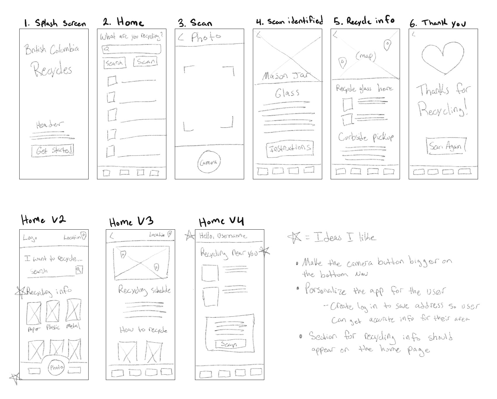
Wire framing is where I really started to see BC Recycles come to life. Keeping my users in mind, I sketched out a flow to help users identify an object by using their phone’s camera feature. During the ideation phase, I sketched out a few different iterations for the home screen because I wanted to make sure the needs of my users were met. I marked a star next to each idea that I thought would be most useful.
Digital Wireframes
My digital wireframes went through a few different iterations. After receiving feedback about my paper wireframes, I learned that making the app focus around where the user lives would be a lot more helpful than my original idea of just scanning an item. By creating an account and having the user input their address, the app would be able to give them more accurate information about when their recycling collection is and where the closest drops offs are. Now, not only will the app tell users how to recycle, it will also show them where to recycle their scanned items.
Low-fidelity prototype
With my digital wireframes finalized I connected each screen to create a low-fidelity prototype. The prototype will take you through the main user flow of identifying an object. Seeing the prototype in action helped me visualize how a user would interact with the app. Check out my low-fidelity prototype.
Mockups and Prototype
Style Guide
To communicate that this app is all about recycling I went with a green color scheme. Green is a common choice when it comes to environmental design, so I chose a variety of greens to communicate cleanliness, simplicity, and energy. For my typography, I went with Rubik because it’s a modern sans-serif font with slightly rounded corners making it clean and easy to read on any screen size.
Onboarding
When a user creates an account, they will be asked for their home location so that the app can give them the most accurate recycling information because every area has different recycling protocol.
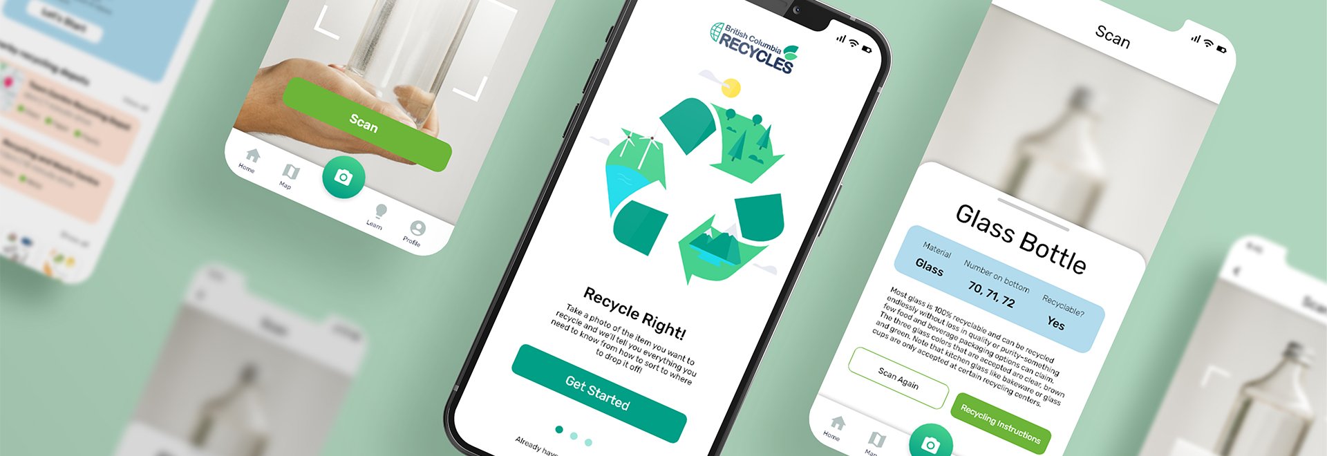
The homepage was the most challenging screen to design. I really had to empathize and think about what information my users needed the most. At the top I put a colored call out box to remind the user when their curbside pickup was scheduled. Then below that I placed a call to action to start a scan, which is the main feature of the app. Below those two items I added recycling depot locations, a sorting guide, and frequently asked questions because I thought these would be the most helpful to users who are new to recycling.
Scanning an item
The main feature of the app is being able to scan an item and have the app identify how to recycle the object. Users want to recycle but think it’s too confusing so I wanted to keep the interface as clean as possible and put the most important information up front. On the last screen I even added a sorting video to visually show people how the recycling process works.
Responsive website
Though most people have a smart phone, there are still some who prefer to use websites instead of apps. I took this into consideration and created a responsive website to pair along with the app. The website is more of an information hub than the app, which provides recycling information for a specific item. Since most people do not have a camera attached to their computer, I added the sorting quiz to help users identify an item. Instead of taking a photo, the quiz will ask specific questions about material, color, size, etc and then will identify your item. I added a call to action after the main section of the website to inform people that there is an app that can scan items to help with sorting.
Conclusion
Personal reflection
Ever since I learned what global warming was as a kid, I became extremely passionate about the environment. In school I’ve written many research reports on climate change to try and find ways to educate people about how to reduce their carbon footprint. I am also that passionate person at work that digs through the trash and places items in the correct recycling or composting bins. When I had an opportunity to design for social good, I knew I wanted to design an app to help educate people on how to recycle.
What I learned
I took this opportunity to learn more about the recycling programs that existed in the area I am looking to move to, British Columbia, and designed an app to help users learn how to recycle. Their recycling program is a lot more advanced than the one in my hometown and I was excited to learn that you’re able to recycle Styrofoam (which I always thought was something that was unable to be recycled). During my research phase, it was refreshing to learn that a huge city like Vancouver is already doing so much for the environment. I also enjoyed talking to a few locals to see what initial information they already knew about recycling.
British Columbia Recycles is still a work in progress but that’s the beauty of user experience. As I gained feedback from users I realized that there is a lot more to add and revise. One user asked if the app could identify food contamination on objects and how to deal with that. When I heard that question I realized that I had only scratched the surface when conducting research and that there’s a lot more to be done. Making connections with people and understanding where they come from is why I love user experience design.


